bowen-sant design / branding specialist

logo / stationary / store interior & exterior / uniforms / promotional material / advertising
AMANO GELATO
The Italian meaning for Amano is "by hand". Amano believe in real authentic Italian gelato without any additives. It's this pure approach that sets Amano apart from other gelato (or ice cream for us Australians).
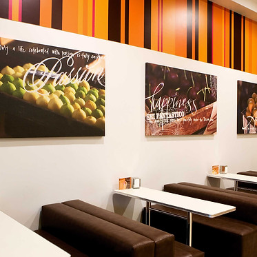
Ok here's the heads up, designing for a gelato company is pretty great as you get to eat your fill of delicious gelato, pretty hard not to love that! Amano was designed to be franchised so taking that into account the design had to be a series of seperate elements to be pulled apart and put back together in new spaces. These sections are- Logo, stripes, typography and a series of wall graphics.
The logo itself is based on a script thats been written in chocolate sauce. It's a simple but fun logo type that sits easily in lots of different spaces and can be used in different sub brands easily.
This project was completed at Block.


